The beverage market has a sustainability problem.
Palet was a speculative alcohol-free, bottle-free drink tablet created to explore whether there was demand for a high-end drinking experience without the bottle. Using a heat-testing methodology, we explored the opportunity for a new kind of drinking experience before the product existed: developing the concept, brand, brand positioning, and creative territories to see what resonated with consumers.
Palet
LOGO | BRAND SYSTEM | BRAND POSITIONING | CREATIVE CONCEPT TESTING | WORKING AD SETS | ORGANIC POSTS


We looked at shifting attitudes around alcohol, sustainability, convenience, and premium drinking experiences to understand what could make a bottle-free beverage feel desirable rather than like a compromise. The research helped uncover different strategic opportunities for how Palet could enter the market.
Research
The result: three brand concepts
Sustainable · Simple · Clean
“Do good. Feel good. Drink well.”
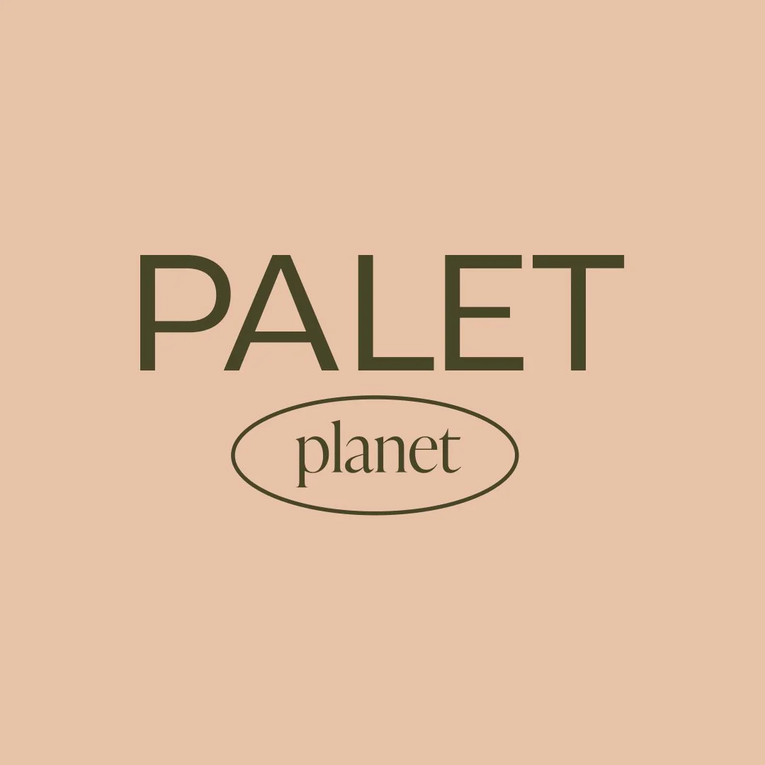
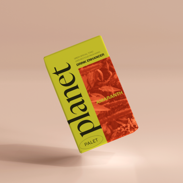
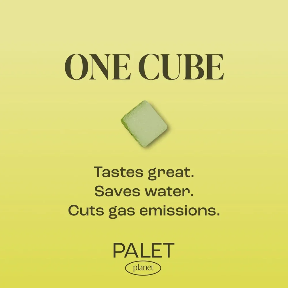
A calm, approachable direction centered on sustainability, clean ingredients, and simplicity.
Soft earthy colors, gentle typography, and cohesive visuals make sustainability feel beautiful and accessible.
Palet Planet

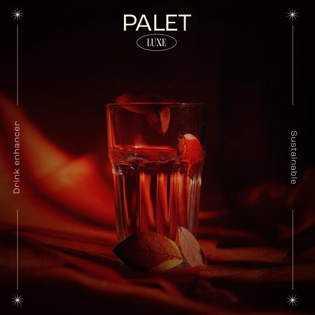
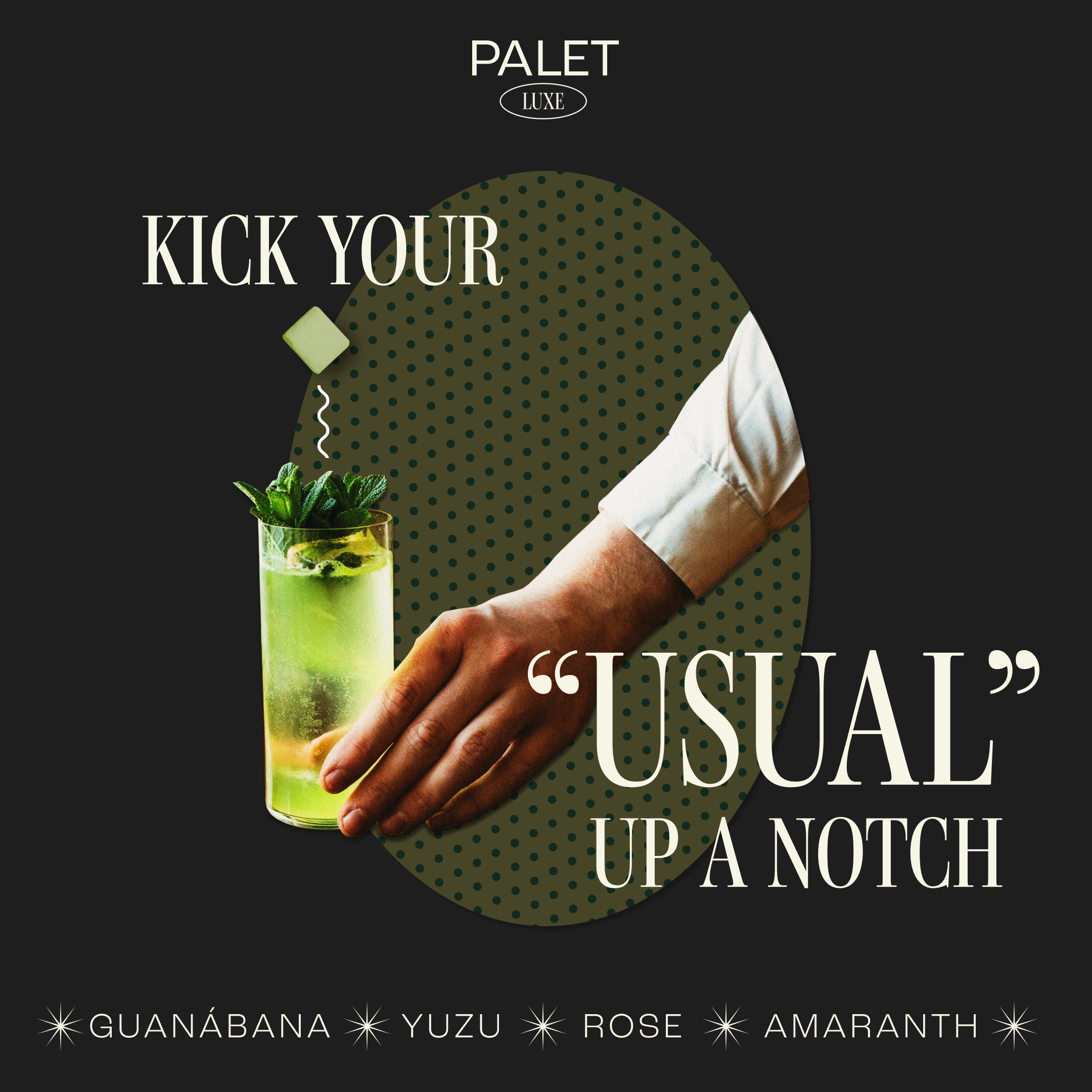
Elevated · Sensual · Powerful
“Exotic flavor, exquisite ease.”
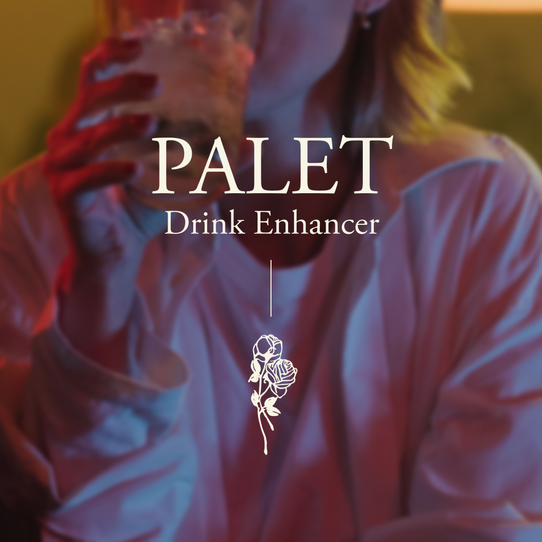
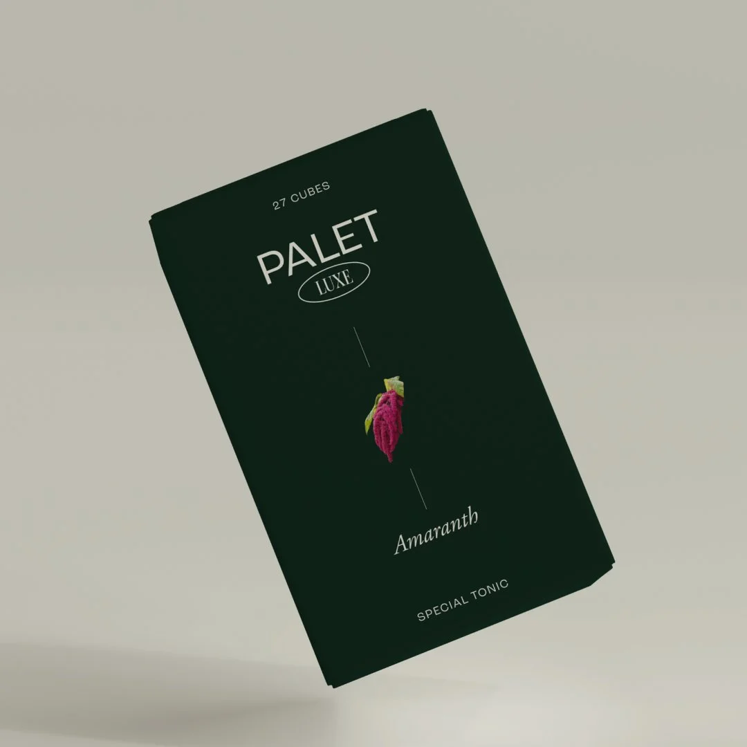
A sophisticated interpretation that transforms a simple tablet into an elevated at-home experience.
Dark tones, rich textures, high contrast, and confident imagery create a sense of indulgence and luxury.
Palet Luxe
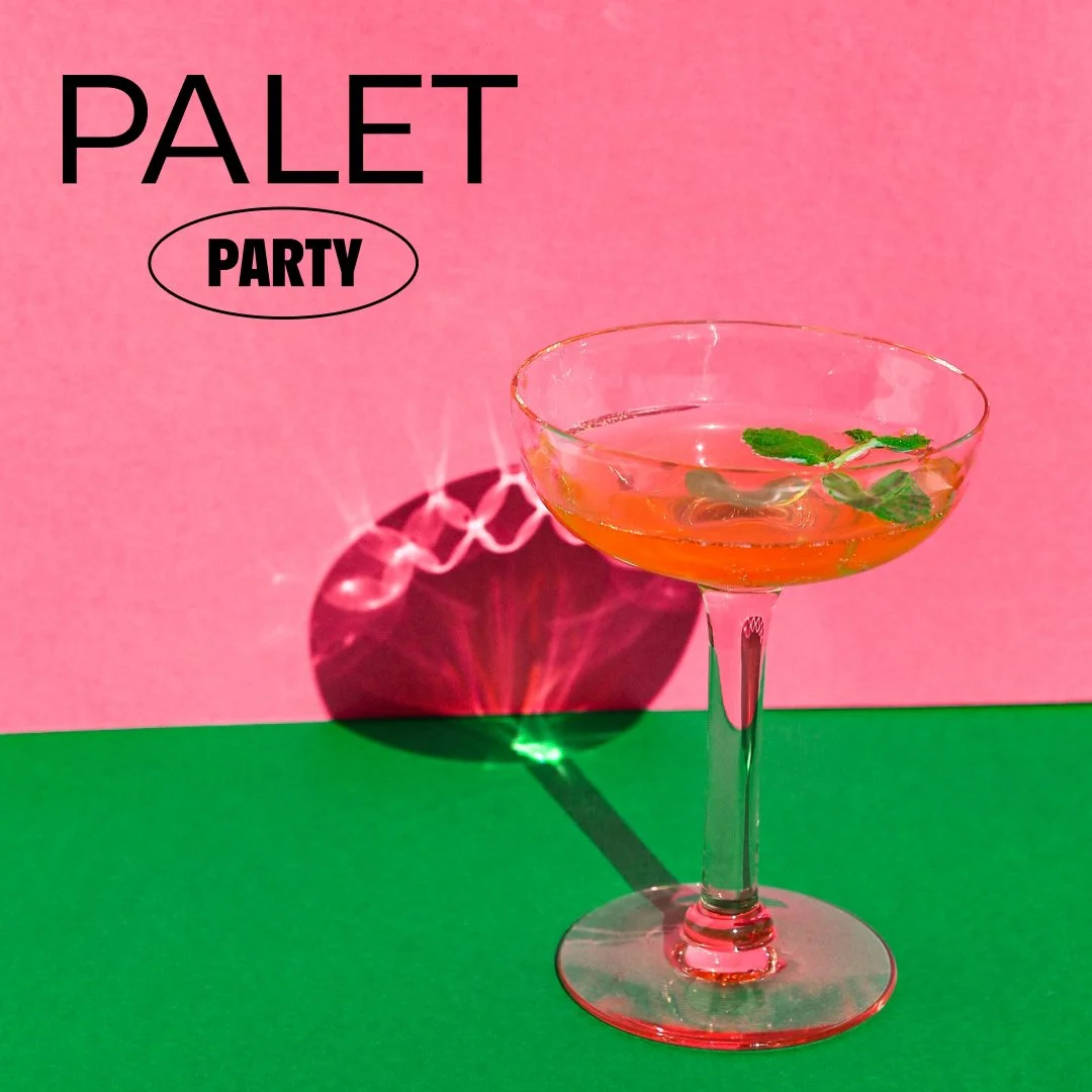
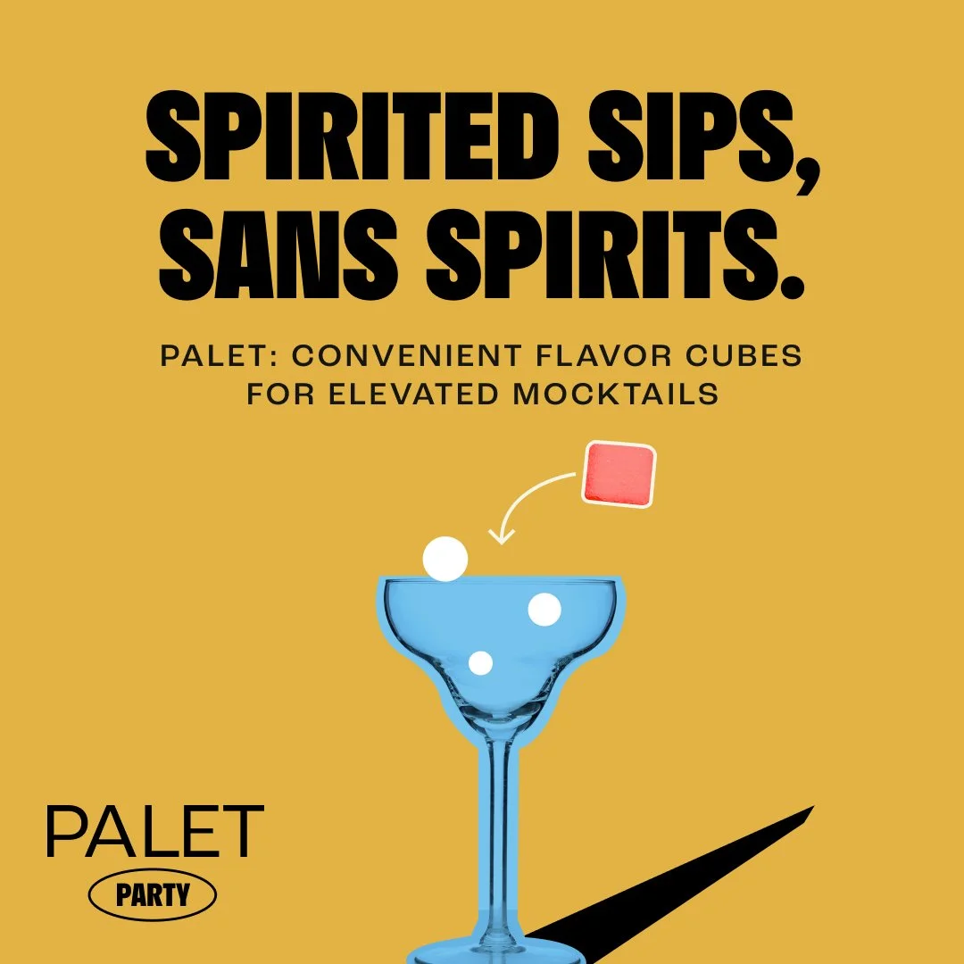
Fun · Graphic · Social
“The drink without the downer.”
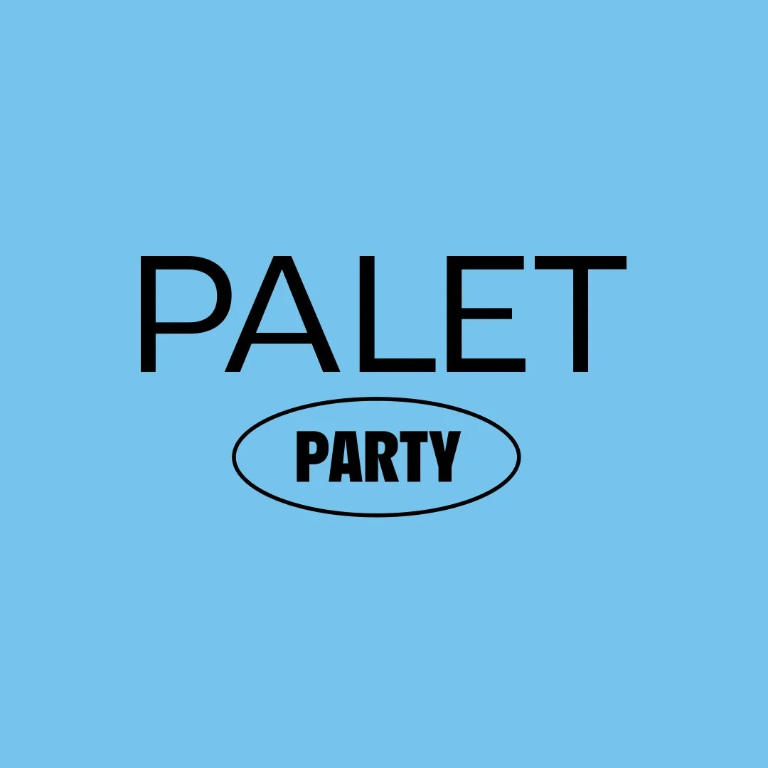
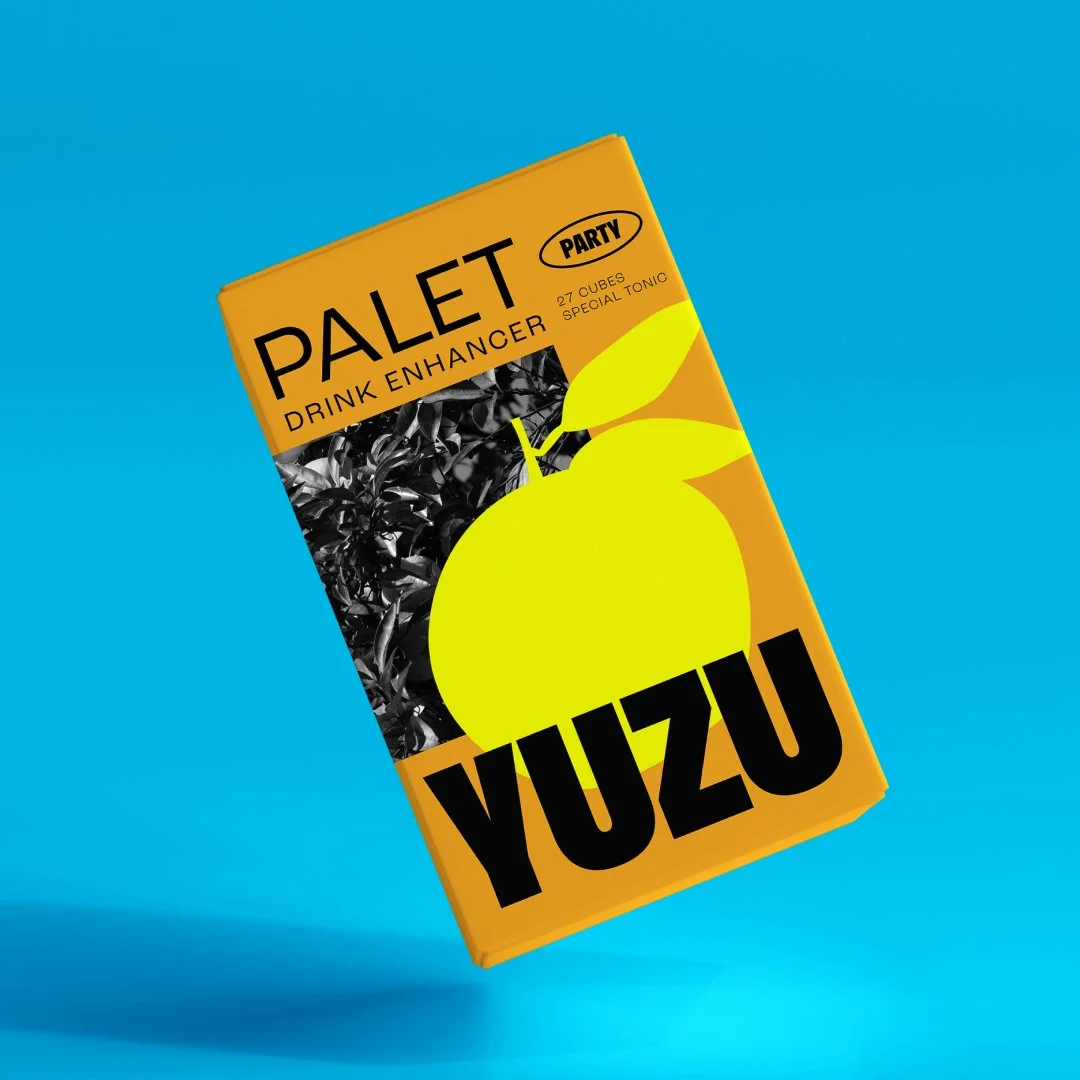
A bold, energetic take on the alternative-to-alcohol space.
Saturated color, expressive graphics, and playful messaging position Palet as something to mix, share, and bring into social occasions.
Palet Party
From concept to market
Each direction was developed into a distinct creative system, spanning organic social content, advertising, and campaign assets.
The concepts were then heat-tested in the market to explore audience response and identify which creative territory showed the strongest potential.
Other projects